Mortality rates did not increase in December in US
According to Hoyt:
There was also little evidence of an increased mortality rate in Europe during this time period. Here is more on the current US mortality rate.
Let me preface this by saying that I’m not a statistician. I’m not an epidemiologist, nor am I a medical doctor, or even a schmuck with an undergrad in biology. My degrees are in Industrial Management and Automotive Technology. I am a long term organ transplant recipient who has lived with being immunocompromised long enough to take interest in these subjects because disease activity has more potential impact on me than on the average person.The actual data tends to refute the argument of Democrats like Nancy Pelosi that Trump was ignoring the evidence of the virus in December before he did the travel ban in January which she and other Democrats opposed as did a substantial portion of the media. It is a graphic indication of the bd faith of their political attacks against the President.
I’ve been watching CDC’s flu surveillance since last fall when there were rumors floating about of a nasty new flu bug in China. That’s not that unusual, there seems to always be rumors of nasty new bugs in China. According to the South China Post the first COVID-19 case in Hubei province China was found November 17. Even that article states that patient zero may have been earlier than that. This page on FlightRadar24.com shows the Wuhan Tianhe airport serves many domestic and international routes. I contend that it is reasonable to believe that the SARS-COV-2 virus began circulating around the global population back in November and December, spreading not only across China, but to much of the world.
When considering that possibility patterns in CDC’s regular ILI (Influenza Like Illness) surveillance data become interesting. I’ve taken their data, and applied my meager Excel skills to chart out some things that surprised me. Going into this, I expected to see mortality rates somewhere bump. Prior to January we weren’t looking for this virus. We’ve only had useful testing capability for a few weeks now. Given the information we have on disease progression, I assumed that there would be an upward trend in Pneumonia mortality as without looking for and testing for SARS-COV-2, victims should have been classified as deaths due to pneumonia. So I charted it, with the last 6 years of data published by CDC.
CDC calls week 40 of a year the beginning of the flu season, so all my charts are set to begin in week 40 of one year and end in week 39 of the next, showing years as flu seasons.
There is the customary increase at week 1, I assume related to holiday festivities and travel. However the 2019-2020 season shows week by week pneumonia mortality to be low compared to the last few years, which is not what I expected. What I truly did not expect was the sharp decline over the last few weeks.
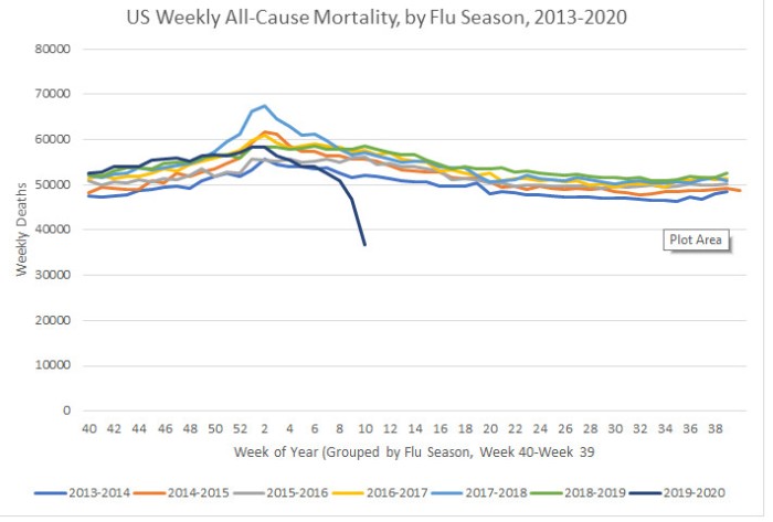
I next looked at all-cause mortality. Perhaps COVID-19 deaths hadn’t been captured in the pneumonia data. But surely something this virulent would show somewhere. I was again, surprised.
We see here that all-cause mortality ran on the high side of normal until it started to drop at the beginning of 2020, and recently dropped significantly. Again, no indication of this virus killing people beyond seasonal norms.
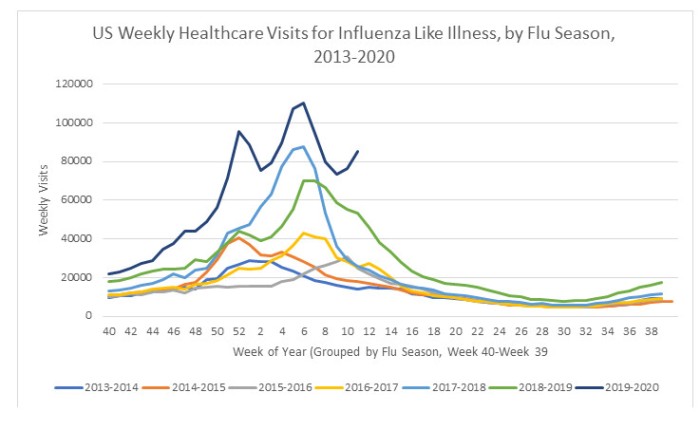
There is one other salient point that stands out in my sifting of data. Healthcare visits for ILI. [Influenza Like Illness.]
Here we see that people in the US have been seeing their doctors for influenza like illness at higher levels than normal. The recent upswing can be explained by the current panic, but prior to that? Most likely it’s more people getting sick enough with respiratory infections to see the doctor.
...

There was also little evidence of an increased mortality rate in Europe during this time period. Here is more on the current US mortality rate.
Comments
Post a Comment